Shop
DreamUp AI Art
DreamUp
Join
Log In
User Menu
Upgrade to Core
Theme
Display Mature Content
Suppress AI Content
Get Help and Send Feedback
Terms of Service
Privacy Policy
Submit
Deviation
Submit your art
Upload your creations for people to see, favourite, and share.
DreamUp
Turn your dreams into reality
Generate your own AI work.
Status Update
Post an update
Tell the community what’s on your mind.
Journal
Post a journal
Share your thoughts, experiences, and stories behind the art.
Literature
Submit your writing
Upload stories, poems, character descriptions & more.
Subscription
Get your fans' support
Fund your creativity by creating subscription tiers.
Cyanoxide on DeviantArt
https://www.deviantart.com/cyanoxide/art/Portfolio-Version-Four-352929067
Cyanoxide
Deviation Actions
Add to Favourites
Comment
More by
Cyanoxide
Watch
Cyanoxide on DeviantArt
https://www.deviantart.com/cyanoxide/art/Rise-of-Iron-614488599
Cyanoxide
Cyanoxide on DeviantArt
https://www.deviantart.com/cyanoxide/art/Joker-s-Awakening-781949133
Cyanoxide
Cyanoxide on DeviantArt
https://www.deviantart.com/cyanoxide/art/I-choose-you-spirit-wolf-818247422
Cyanoxide
Cyanoxide on DeviantArt
https://www.deviantart.com/cyanoxide/art/Life-is-Strange-724160143
Cyanoxide
Cyanoxide on DeviantArt
https://www.deviantart.com/cyanoxide/art/Hayden-Taylor-209324289
Cyanoxide
Cyanoxide on DeviantArt
https://www.deviantart.com/cyanoxide/art/B-u-m-b-l-e-b-e-e-129619287
Cyanoxide
Cyanoxide on DeviantArt
https://www.deviantart.com/cyanoxide/art/G-a-t-e-w-a-y-130609355
Cyanoxide
Cyanoxide on DeviantArt
https://www.deviantart.com/cyanoxide/art/The-Social-Network-Machine-263234081
Cyanoxide
Cyanoxide on DeviantArt
https://www.deviantart.com/cyanoxide/art/Sushi-278813462
Cyanoxide
Suggested Deviants
Ikue
Watch
Ikue on DeviantArt
https://www.deviantart.com/ikue/art/Signed-Sealed-Delivered-245775318
Ikue
Ikue on DeviantArt
https://www.deviantart.com/ikue/art/Project-Inspire-CSS-design-134643700
Ikue
Ikue on DeviantArt
https://www.deviantart.com/ikue/art/Break-the-Cycle-CSS-design-131385997
Ikue
templatewire
Watch
templatewire on DeviantArt
https://www.deviantart.com/templatewire/art/Studio7-One-Page-Creative-Template-629183094
templatewire
templatewire on DeviantArt
https://www.deviantart.com/templatewire/art/Verum-Free-Resume-CV-Template-625742123
templatewire
templatewire on DeviantArt
https://www.deviantart.com/templatewire/art/Spectrum-One-Page-Portfolio-Template-627769467
templatewire
F-l-a-g
Watch
F-l-a-g on DeviantArt
https://www.deviantart.com/f-l-a-g/art/Portfolio-v2-210927637
F-l-a-g
F-l-a-g on DeviantArt
https://www.deviantart.com/f-l-a-g/art/Portfolio-v3-211662612
F-l-a-g
F-l-a-g on DeviantArt
https://www.deviantart.com/f-l-a-g/art/Respeterate-Theme-298005436
F-l-a-g
Suggested Collections
PS PSDs
NishithV on DeviantArt
http://creativecommons.org/licenses/by-sa/3.0/
https://www.deviantart.com/nishithv/art/Webpage-Template-free-PSD-263499737
NishithV
So-ghislaine on DeviantArt
https://www.deviantart.com/so-ghislaine/art/PSD-Pink-Waves-Web-Layout-367925529
So-ghislaine
NishithV on DeviantArt
http://creativecommons.org/licenses/by-sa/3.0/
https://www.deviantart.com/nishithv/art/Price-Table-Set-V2-PSD-260506965
NishithV
Layout
sandracz on DeviantArt
https://www.deviantart.com/sandracz/art/Theme-for-CreAtive-Solutions-418037056
sandracz
webdesigngeek on DeviantArt
https://www.deviantart.com/webdesigngeek/art/GeekApp-One-Page-App-Landing-PSD-Template-472303213
webdesigngeek
sandracz on DeviantArt
https://www.deviantart.com/sandracz/art/3Angle-Agency-Creative-HTML-Template-414491408
sandracz
Webdesign
Andasolo on DeviantArt
https://www.deviantart.com/andasolo/art/energydesign-Portfolio-Sold-288152509
Andasolo
vBabic on DeviantArt
https://www.deviantart.com/vbabic/art/Fence-346220516
vBabic
wosiek66 on DeviantArt
https://www.deviantart.com/wosiek66/art/DEJA-VU-FASHION-326749467
wosiek66
You Might Like…
templatewire on DeviantArt
https://www.deviantart.com/templatewire/art/Studio7-One-Page-Creative-Template-629183094
templatewire
vikas1307 on DeviantArt
http://creativecommons.org/licenses/by-nd/3.0/
https://www.deviantart.com/vikas1307/art/webdesign-3-279901353
vikas1307
eXPerienceARTS on DeviantArt
https://www.deviantart.com/experiencearts/art/My-Portfolio-Final-181325981
eXPerienceARTS
F-l-a-g on DeviantArt
https://www.deviantart.com/f-l-a-g/art/Portfolio-v2-210927637
F-l-a-g
sheko-elanteko on DeviantArt
https://www.deviantart.com/sheko-elanteko/art/Deft-Design-Light-And-Dark-Responsive-Template-302757488
sheko-elanteko
designerscouch on DeviantArt
https://www.deviantart.com/designerscouch/art/v6-by-AlxDesign-92119623
designerscouch
sandracz on DeviantArt
https://www.deviantart.com/sandracz/art/Blogo-Stylish-WP-Theme-389207091
sandracz
DodoWeb on DeviantArt
https://www.deviantart.com/dodoweb/art/Blogo-Home-Page-263036018
DodoWeb
basstar on DeviantArt
https://www.deviantart.com/basstar/art/TXB040-69465239
basstar
Featured in Groups
See All
DevWebdesign
Superior-Web-Design
Excellent-Webdesign
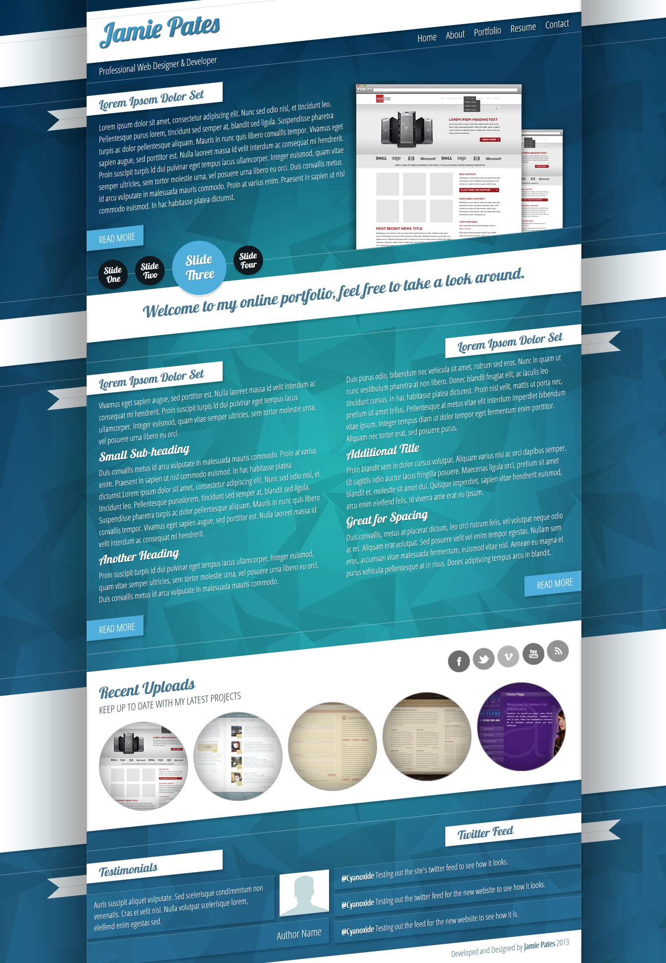
Portfolio Version Four
By
Cyanoxide
Watch
Published:
Feb 7, 2013
31
Favourites
18
Comments
2.3K
Views
Description
Another upgrade to my portfolio. Thought I'd try something a lot less generic than my normal.
Image size
1346x1948px 1.31 MB
© 2013 - 2024
Cyanoxide
Comments
18
Join the community
to add your comment. Already a deviant?
Log In
swati05
Feb 13, 2013
Nice!
Reply
Load more


 (Smile)")